The new logo of Dak Lak, selected through a nationwide competition, embodies cultural and historical values as well as a strong aspiration for advancement, marking a new phase in building a distinctive and dynamic provincial identity.
Following the administrative merger between Dak Lak and Phu Yen, demand for a unified identity symbol became urgent. In response, the logo design competition attracted widespread attention from professionals nationwide. Within just one month of launch, Organising Committee received 402 entries from 183 authors, including professional artists, designers, creative groups and companies.
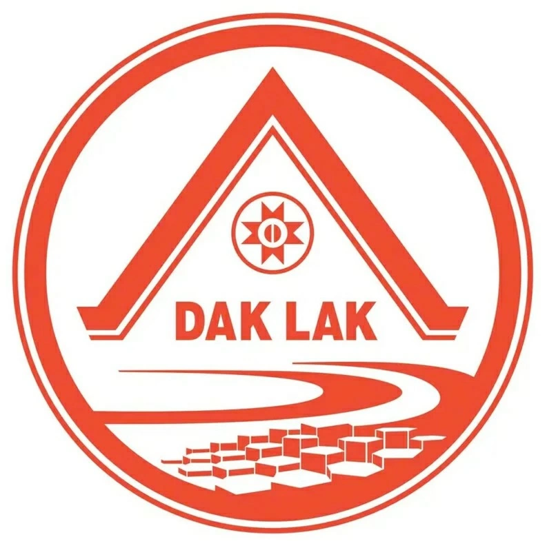 |
| Dak Lak provincial brand identity logo. |
To ensure objectivity, Organising Committee invited reputable experts and artists from central-level professional associations to serve on jury. The entries were assessed against rigorous criteria, including artistic quality, symbolic value, creativity and practical recognisability.
Artist Vi Kien Thanh, Vice Chairman of the Vietnam Fine Arts Association and jury member, commented: “This year’s submissions demonstrate a very high level of professional expertise. Numerous designs employ modern, minimalist visual language while still conveying historical depth alongside geographical characteristics of Dak Lak in its new development phase”.
Ms. Nie Thanh Mai, Chairwoman of the provincial Literature and Arts Association and Deputy Head of the Organising Committee, noted that submitted ideas were not only diverse in form but also introduced new approaches to promoting local image, helping select a symbol aligned with Dak Lak’s long-term development.
Positioning the local brand
After multiple rigorous selection rounds, the design by Ms. Hoang Thi Thu Thao from Da Nang city was chosen as the official logo of Dak Lak province for the new period.
Explaining her concept, the designer said that the logo was inspired by the geographical convergence and longstanding connection between Dak Lak and Phu Yen. It adopts a modern, concise design, featuring the longhouse at centre, a symbol of Central Highlands culture associated with community life and solidarity. This is combined with an eight-rayed sun motif, representing growth together with vitality in traditional patterns.
 |
| Provincial leaders launching the Dak Lak brand identity logo. |
A coffee bean is a central element, reflecting the province’s agricultural strengths and its distinctive brand. It also symbolises diligence, creativity and aspiration for development of local people during integration process.
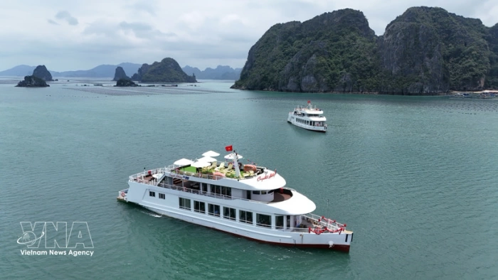
Another highlight is coastline motif, combined with a form inspired by Da Dia reef, a distinctive landmark in the eastern region. Inclusion of this element both expands the expressive space and reflects a vision of diversified development, strengthening regional connectivity together with promoting marine economy, tourism and trade.
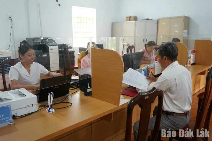
According to Mr. Tran Hong Tien, Director of Dak Lak Department of Culture, Sports and Tourism, selected logo will serve as the official identity in political, external affairs and socio-eco development activities. It will also help promote the provincial image internationally and foster public pride.
With this new identity, Dak Lak is poised to enter a new phase of rapid development. The harmonious combination of highlands and sea creates a distinctive cultural imprint while opening up new development opportunities.
Translated by KHUONG THAO